Sunday 24 October 2010

Magazine Questionnaire - Results

Male - 11           Female - 9

Prices; £1.50 - £2.00 - 3
           £2.00 - £2.50 - 5
           £2.50 - £3.00 - 5
                          £3+ - 7

Most Popular Words Associated with Pop/Rock - Guitar (10)          Drum (3)
                                                                             Mosher (4)          Instruments (3)
                                                                             Concert (4)

Top 3 Colours Associated with Pop/Rock - Red (12)      Black (12)      Yellow + Dark ones (4)

Regularity of Buying Magazines; Weekly - 1
                                                 Fortnightly - 2
                                                 Monthly - 12
                                                 Other - 5

Most Popular Magazines; NME (10)   Kerrang (7)   Q (6)

Likes of Music Magazines; Interviews (7)   Articles on Bands (6)   Band Info (4)  Posters (4) 
                                                        Whats New? (3)       Reviews (3)

Dislikes of Music Magazines;  Adverts (14)   Artists People Dont Like (3)  

Interview With Whole Band      Whole Band (19)        Rest of Band (1)
 or just lead singer?                          Just Lead Singer (0)

Most Popular Pop/Rock bands;   Paramore (7)    Lost Prophets (4)    Kings of Leon (2)  
                                                           Ellie Goulding (3)      Linkin Park (3)


From these results, i can see that most of the people i questioned were male, which means i will focus my attention mostly on the male audience, but still make it appealing too women. From the second graph, i can see that the most popular artist is Paramore, followed by Lost Prophets. Too appeal to my target audience, i will focus my attention of my front cover on one of these two artists, and possibly my Double Page spread aswell.
From the first graph (blue bars), i can see that people tend to buy Magazines on a monthly basis. To help the sales of my magazine, i will focus my attention on selling my magazine on a monthly basis only. From the final graph, i can see that most people are willing to pay over £3.00 for a music magazine. This can increase the profit of my magazine, as it means i can increase the price it can be sold as.

Tuesday 19 October 2010

Monday 18 October 2010

Questionnaire

1, Are you;   Male                    Female          

2. How much would you be willing to pay for a Pop/Rock magazine? (Please circle)
£1.50-£2.00                             £2.00-£2.50                    £2.50-£3.00
£3.00+ (Please Specify)  _________

3. When you hear the genre Pop/Rock, what 3 words do you think of?


4. What Colour(s) do you most associate with Pop/Rock?


5. How often do you buy a music magazine? (Please Circle)
Daily                       Weekly                         Monthly
Other (Please Specify) ___________________

6.  Which music magazine(s) do you tend to buy?


7. What do you like to see in music magazines?


8. What don’t you like to see in music magazines?


9.Would you rather an interview with a whole band or just the lead singer?


10. Who are your favourite Pop/Rock artists?


Saturday 16 October 2010

Codes and Convetions of a Magazine Double Page Spread

  • Heading
  • Font Size
  • Drop Cap
  • Drop Quote
  • Strap Line
  • ByLine
  • Main Image
  • Name Of Magazine In Corner
  • Stand First
  • Columns
Heading - This usually stretches across both pages. Biggest Font used on the Page.

Font Size - Usually between 9-12 for the text. Heading much larger.

Drop Cap - First letter of main article text. Produced using Quark

Drop Quote - Qoute in the middle of the article taken from the article itself. Large font.

Strap Line - At top of page

ByLine - Almost like Credits from a film. Names of Interviewer and Photographer

Main Image - This links directly to text on that page. Can be Background/On Background

Name Of Magazine In Corner - Next to page number, Magazine title also there

Stand Firsts - Stands alone underneath title and sums up whole article. Larger Font and Darker Background

Columns - Text written in columns

Thursday 14 October 2010

Initial Plans

Frequency of Publication; Every 2 weeks, making up 24 a year

Price; between £2-£3

Genre; Pop/Rock, Rock,

Issue Size; About 50-80 pages depending on Content

Feature Articles; Main Double Page Spread, possibly Paramore!
  • Lost Prophets - Our story.  COVER LINE FOR FRONT COVER ONLY!
  • Linkin Park report on their latest tour and reveal some secrets we never knew! COVER LINE FOR FRONT COVER ONLY!
  • Kings of Leon on what took them so long to bring a new album out! COVER LINE FOR FRONT COVER ONLY!

Regular Content;  Latest News in the Music Business
                            Reviews
                            New Albums Released/In Production
                            Free Poster
                            New tour dates and latest tour news
                            Top 20 UK albums and Top 40 tracks! With a seasonal review every 3 months
                           

Wednesday 13 October 2010

Researching the Marketplace


• Price ; £2.30
• Frequency of Publication; Weekly.
• Average Issue Size;  Roughly about 80 Pages
• Regular Content; 'First Night, On The Road' and 'In the Studio' which report on major tours and upcoming albums.
• Feature Articles; On this issue – Magnetic Man, GIGGS, Klaxons, Crocodiles, Noah and the Whale, Interpol


• Price;  £1.99
• Frequency of Publication;  Weekly
• Issue Size; 220 pages, Average
• Regular Content; gig dates section and album reviews, the news
parts will keep you up to date
• Feature Articles; Paramore, List at bottom of front cover

Tuesday 12 October 2010

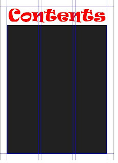
Quark Express Screenshots - Preliminary Contents Page

Image Titles Added

Features and Regulars Added under Respective Title

Normal Features and Other Features Titles

Images for Contents Page - 3 Featured Pages

Page Title Added To Background


Background Colour


Starting Grid


Monday 11 October 2010

Evaluation of Preliminary Work

In what ways does your media product use, develop or challenge forms and conventions of real media products?
To capture the images I used for my contents and front page, I used a digital camera that the school provided for us. After collecting the images I required I used Photoshop to put them onto my front cover, and Quark Express for my contents page. To deviate from the normal conventions, my banner on my front page goes diagonally across the page. This is something I will change when it comes to my music magazine because it does not follow the codes and conventions and does not look good. Also, my masthead changes colour which also deviates from the codes and conventions, this will also have to be changed. My central image on my front cover is looking at the buyer of the magazine which is known as Direct Mode of Address. This is a technique used as it makes the customer feel that the person in the main image is looking at them and telling them to buy the product. This is a good technique to use when creating my music magazine front cover.

How did you use new media technologies in the constriction of your media product?
To create my front cover and contents page, I used Quark Express and Adobe Photoshop.  In my opinion, Quark express is easier to use as it allows easier movement around the page rather than Photoshop. Although Photoshop does have some advantages i.e. colour schemes, styles of text and photo editing software, it is a lot more complicated to understand rather than Quark which is more simple and easy. Quark express is the software I will use for both my music magazine Contents page and Double Page Spread.

What are the strengths and weaknesses of both the product and your use of new media technologies?
One of the strengths of my product is that my main image on my front cover is direct mode of address which is a good technique to use as it captures the audience’s attention and almost speaks to them telling them to buy the product. A weakness is my banner on my contents page and the colour scheme. The colour scheme on my home page is light colours i.e. blue yellow and red, whereas on my contents it is a black background. This completely contrasts as the homepage is saying it’s a bright colourful magazine, whereas the contents page is much darker and perhaps is saying it’s not as a friendly magazine as the homepage may think. I also learnt how to use Photoshop and Quark as I have never used the software’s before. I felt I picked up how to use them quickly and easily enough and I am confident I will be able to use them for my music magazine easily enough. A strength I gained was the organisation of quark express and where to place things so they are all spaced out well and easy enough to read at a good size. A weakness I have is manoeuvring things round on Photoshop as I struggled to get some things in the right place that I wanted to.  

Friday 8 October 2010

Preliminary Work Details

Over the last two weeks, we have been creating are Front Cover and Contents page for our school magazines. To do this, we used Adobe Photoshop and QuarkXpress. I used plans previously made to base it on, but made some adjustments as i went through. Most of the images uploaded earlier were used on either my front cover or contents page. Other regular features were also added to my contents page to fill up some space and i thought they would be appropriate to a school magazine.